A homepage, homepage or simply home is a business card on the web. This is the welcome page and serves to guide the user through the site. However, there is one thing the home should not be good for: ranking for keywords other than the brand or company name.
Index
Optimizing the home page for search engines may even work for some sites, but this should not be the only goal of the home page. In this post, I want to explore the main purpose of the home page and give tips on how to make it better!
There is no such thing as homepage SEO!
Perhaps this statement leaves some site owners and SEO’s a bit disgruntled, especially if they have been trying to rank their home pages for a few years.
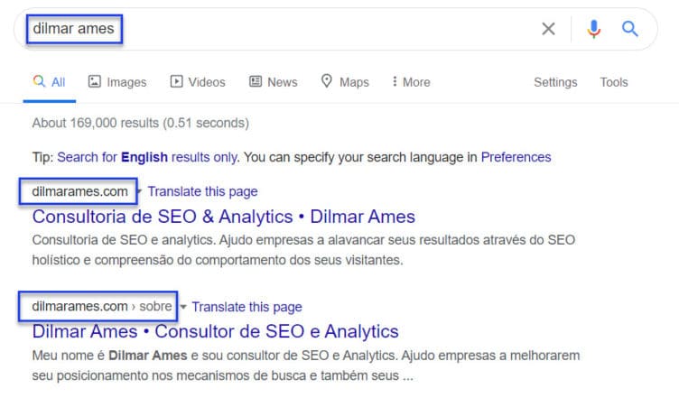
If everything is right with a site’s settings it is very likely that it will be at the top of searches for brand-related terms. Still, sites that have their names based on products and/or services can suffer from competition. For example, if you do a search for “dilmar ames” you will probably find my home in the first position:
However, if you do a search for “digital marketing” you will hardly find the domain “marketingdigital.com.br” in the first positions. If the brand name is a keyword that people can Google, there will be more sites competing for that keyword. As such, the brand will face increased competition for the site name.
Also read: What is SEO?
Why shouldn’t I optimize my home?
There are pages within a website that simply don’t deserve that much attention in keyword planning. You shouldn ‘t spend time trying to optimize your contact, privacy policy, and home pages, for example.
Don’t get me wrong, they need to be optimized but in other aspects such as speed, user experience, and for social networks.
SEO of a homepage
Although you don’t need to optimize your homepage for a keyword, there is still SEO work to be done:
- Make sure the page title focuses on the name of your main brand or product;
- Add a clear and recognizable brand logo;
- There must be a clear, attention-grabbing CTA;
- Be sure to structure your menu well;
- Provide OpenGraph data and Twitter Cards for better social sharing;
- Make sure that the meta description is filled out, that it mentions your products and services and invites the visitor to enter your site;
- Images are inviting but the page needs textual information and a great tagline as well;
- Don’t clutter your home page with a million links. Keep it focused and don’t overload the footer or menu with these links;
- Contact information should be available, including social networks and perhaps even a newsletter subscription;
- If applicable, add a search bar.
Read also: 10 Important items for on-page SEO
Tips for homepage optimization
What is your site about?
The first homepage optimization tip is to check the content of your site. It sounds obvious but your mission should be reflected in your home page.
Many companies and professionals try to optimize their home pages for a certain non-branded keyword. In most cases this is a mistake and can lead to problems such as keyword cannibalization, where two or more pages compete for the positioning of a term in searches.
Is your homepage just a big list of products and services or have you actually taken the time to write a decent welcome to your visitors? Oh, and please, there is nothing more annoying than an owner literally writing on your site “Welcome to our site”.

When I refer to welcoming the visitor I mean what can be found on the site. What is your main product or service? What can be found in your products and in the company itself through the site? And most importantly: what is the main benefit (USP – Unique Selling Point) for the visitor?
Specify your USP
The second home page optimization tip is to make your main benefit clear. Many sites do not make it clear on their homepages what the company is offering.
The examples below were randomly extracted from a search initiated by “digital marketing”. Nothing personal.
Here is a good example of a product/benefit display:
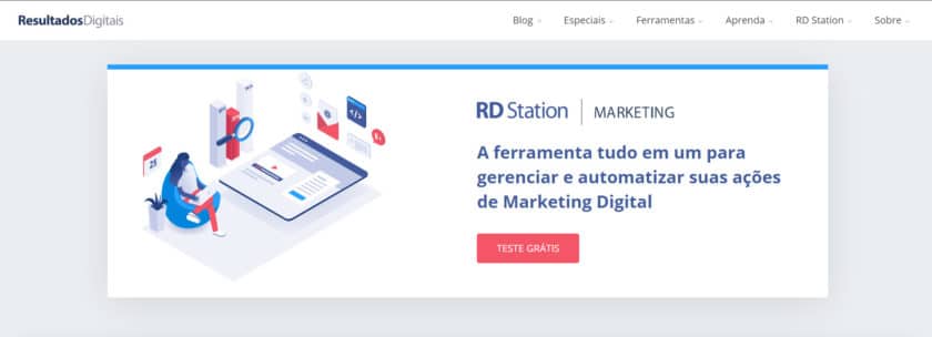
Resultados Digitais shows its main benefit clearly and objectively as soon as the visitor enters the site.
On the other hand, many sites like to use animations and vague descriptions that don’t say much about the business. Take the example of the Criativito Agency. It uses animated text in its above the fold that rotates as follows:

Uhm… good afternoon.
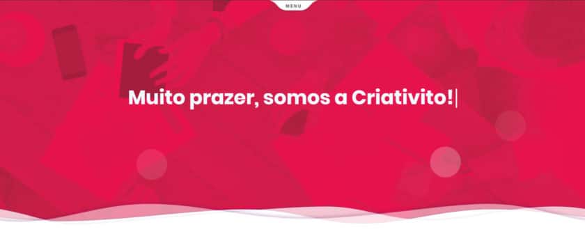
Ok. From my browsing I probably would have noticed this already but they could have displayed the logo in the header instead of the textual presentation.
Many can. How will they do this? What is the product? What is the benefit offered?
What?! Is this serious? The four sentences together take about 20 seconds to display. Who wants to browse a site that makes you wait 20 seconds to understand the business, and then just tells you that you should browse the site. Which one is it? A logo and an open menu would have solved it.
This is a prime area of the home, show the visitor how you can help him.
Vague descriptions or generic terms only work if you have a marketing budget big enough to make it your own. Take McDonald’s “I’m lovin’ it” slogan, for example.
But clarity is not the only thing that matters on the home page.
Guide your visitor
A third purpose of your home page is to orient. You must make sure that the home page directs the visitor to the main pages. Of course the home page needs a good tagline, but it is useless if the home page does not allow the visitor to go to the main or conversion pages.
There are several ways to guide a user. Here are the most common ones on home pages:
Sliders (they suck)
From the subtitle you must have already realized that I don’t like rotating banners. Still, sliders are used very often on homepages.
It is not that they are not beautiful, many are. The problem is that sliders just don’t convert. Less than 1% CTR (click per impression) is not something I expect for a CTA. Also, most sliders cause performance problems and the responsiveness (adaptation to different devices) is not good.
Instead of using a slider, use a good image with a prominent CTA. The chances of conversion increase considerably.
If you still want to use a banner sequence, go ahead. They can, in some cases, be a good way to present different content on the home page with each visit.
Menu
The most obvious way to guide the visitor is the menu. Have you thought about what is on your menu? Is it structured and focused? Is it an open menu or hamburger (both mobile and desktop)?
My recommendation is to be as clear as possible. If you have to use icons or a mega menu go ahead. Just don’t overdo it! The menu does not need to lead to all areas of your site. There are other ways and internal navigation for this.
But do me a favor, be clear! If a page is a contact page, use “contact” and not “let’s chat!” or “hello”. Of course, some companies manage to have a “cool” identity and speak to their target audience in the same way, and this is fine. What a law firm cannot do is use a “let’s have a chat!” You probably won’t talk to your audience.
Products
If you have an online store, the possibilities are endless. But don’t add the entire list of categories to your home sidebar. Concentrate on the most visited categories and add them in a prominent place on your home page. Add your best-selling product, perhaps an enlarged image (hero). Be creative.
Your home page may be the best place on your site to advertise a new product, for example. Always check how much of your sales are originating from or have influence from the homepage.
Search
On most websites the search bar is located in the header. If you are selling hundreds or thousands of products or have written many articles it is likely that a search bar will be useful to the visitor.
Why not make it your main CTA? That is the second step. The first step is to make sure that your search results pages look decent and offer good results.
Visitors who use internal research generally convert more and are more engaged.
Contact
Assume that many visitors may return to your site just to find a way to contact you. Don’t make it difficult for them. Have a contact link in your main menu. It can also be an address in the footer or a (short) contact form in the sidebar.
Avoiding exaggeration
Guiding the user within a site is an art. Practice this art without overdoing it. Don’t use highlighting on all the elements or mess up your organization. Too much information can confuse the user and lead to low conversion rates.
Choose the CTAs that make sense for your type of business/website and have focus.
Homepage Optimization: Conclusion
Your homepage should make it clear what people can find on your site. It should focus on its main benefit. It should also guide your visitors to the most important pages.
Who knows, you might be able to optimize for user experience and even rank your homepage for some terms. Don’t be sad if the latter doesn’t happen, but don’t fail to do the former.
If you are having trouble optimizing your site, please contact us.